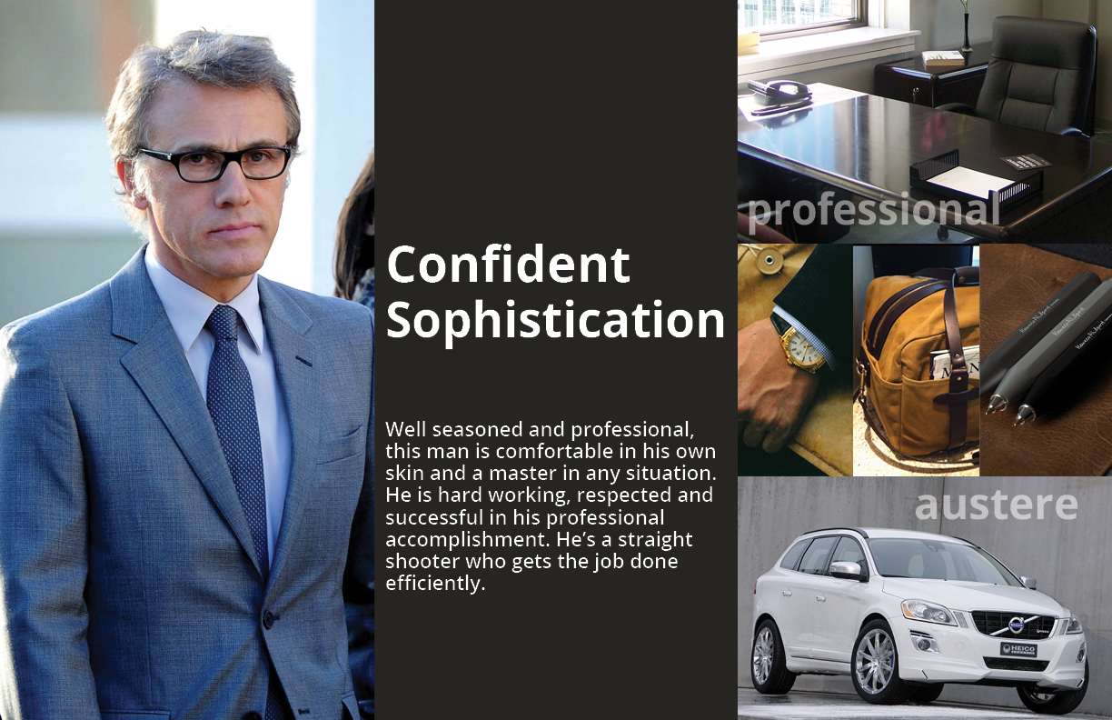
What is low testosterone?
Low-T is medically known as hypogonadism and it affects roughly 39% of men over the age of 45*. Testosterone replacement has been shown to improve a man's energy, bone density, strength, libido, and erections as well as reduce depression.
This particular client has cornered the market for low-testosterone treatment. Therefore they had a much larger budget to build a dispenser that would dominate the market by creating a truly seamless user experience.
*American Urological Institute

The main pain points that the design team attempted to solve through several design archetypes was to get at a form that indicates the proper hand placement (far away from applicator head) and intuitively indicates where to apply the medication.
The client's product is currently packaged as the blue pump on the left. After months of ethnographic and human factors research with Radius as a partner, the highly engineered dispenser on the right was developed and agreed upon by all sides.

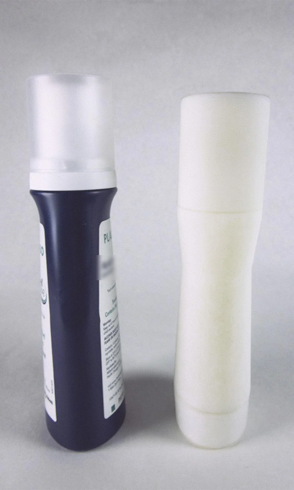
The engineering team spent many months making sure that it addresses a number of issues from child safety to very accurate dose counting. The driving mechanism for the dose counter is a harmonic drive. The lead industrial designer had worked alongside the team and funneled the number of dispenser options down to this applicator archetype.

This form allows for a more intuitive application process because it resembles a deodorant bottle and thus semantically communicates that the medicine should be applied to the underarm. One final question remained...
How might we normalize and better integrate the medicine's application into the lives of men suffering from low-testosterone through it's aesthetics?
Low-testosterone has not yet been widely accepted among medical professionals as a condition and so men suffering from low-testosterone feel embarrassed and stigmatized by the condition and treatment. The deodorant-like shape already presents the opportunity for discretion, so the design team decided the best approach for the design refinements would be to create 4 empowering design platforms.

We decided to develop initial concepts as well to help illustrate each platform and to show a range from a basic treatment to a more comprehensive visual identity.

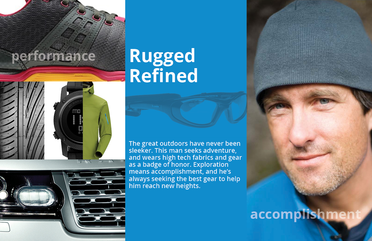
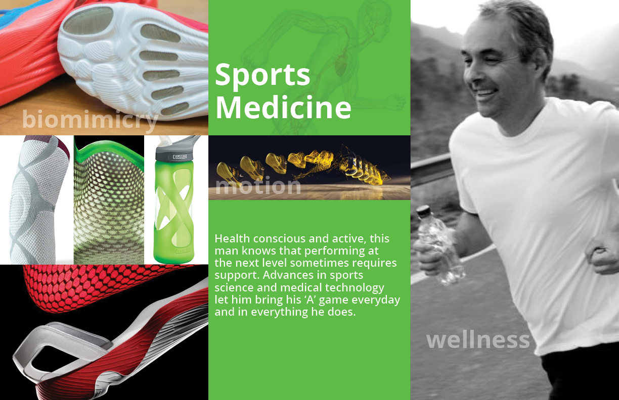
The design platforms, mood boards and concepts below were tested with current users to see which visual identity resonated the best with them. After the surveys, it became clear the "Rugged Refined" and "Sports Medicine" were the design platforms that connected best with current users.
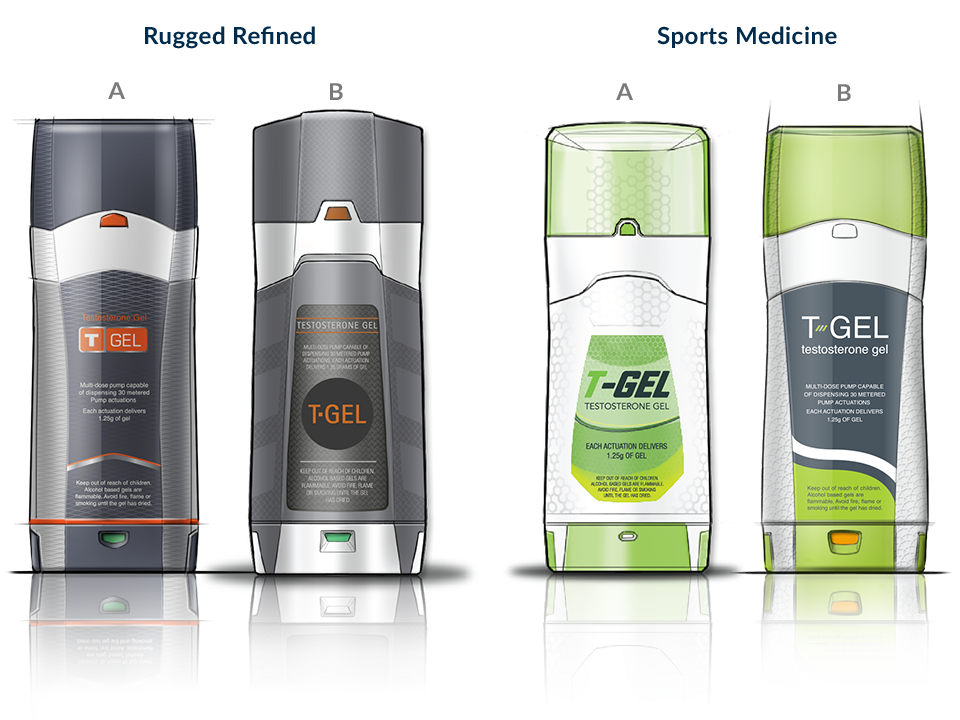

Concept A for Rugged Refined and Concept B for Sports Medicine were chosen as final directions and redone in the current brand colors. There was a gravitation toward the faceted concepts that cut the top view from an oval into an octagon because of the nice chiseled line it gives to the main body. The highlighted lines subtly reference broad, masculine shoulders.


The team and I decided to do an online and retail audit of REI and Erewhon Mountain Outfitters to better understand the design details that best illustrate Rugged Refined. We specifically looked for patterns, textures and iconic shapes that make up that visual identity. For Sports Medicine, we decided to visit Target and other smaller drug stores since there is no single retailer that specializes in that kind of brand language.

For Rugged Refined, we identified a layering of micro patterns embedded into macro patterns with very subdued color schemes. The patterns themselves varied between angular facets to interlocking pill shapes.
We worked in tandem with a graphic designer to ensure a unified look and to help articulate the brand variations within the design platform. The client had made it clear they were not sure yet if the new dispenser would be unveiled under a different brand name.

For Sports Medicine, the team latched onto the idea of progression and movement for the design details. For example, a dot pattern would need to disperse or change in size. The patterns also needed to look more structural but still soft enough to mimic organic matter.
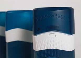
The farthest design to the left, was ultimately chosen because the textured surface near the top of the dispenser is meant to be a tactile cue to the user that they should place their thumb on that surface and not any higher.

After several more rounds of testing and tweaking, the new dispenser is being optimized and designed for manufacture. One of the biggest challenges to the design intent, was color matching the translucent cap with the main body. After many incorrect samples, it took a trip to Clariant's Technology Center and the suggestion of changing the loading ratio of plastic to pigment from 4% to 3% to get the right color match.
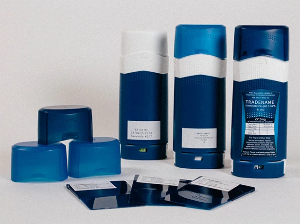
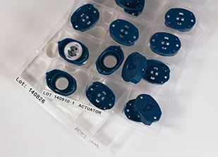
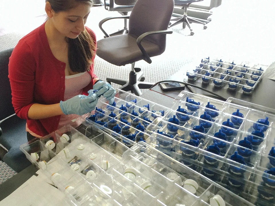
We even go the opportunity to simulate the tasks and potential mistakes an assembly line worker might go through in order to develop a robust manufacturing and assembly guide.